What does a corporate website need?
Most people meet a company on its website first: clients, investors, partners, future hires. A corporate site has to say what the company does within seconds and move the right person to get in touch. Below are the parts of such a site and what to check before launch.
The three questions a corporate site answers
On the first screen a visitor looks for three answers: what does this company do, who does it do it for, and why should I trust it. Every section on the site should answer one of the three; if it does not, it is taking up space.
The most common problem on corporate sites is describing the industry rather than the company: lines like “quality service” and “customer satisfaction” that any firm could claim. Concrete things stay in mind: how many projects, which fields, which cities, which work.
The first screen: the company in one scene
The first screen should make the company's scale and character felt at once. Sometimes a single strong image does it, sometimes motion does.
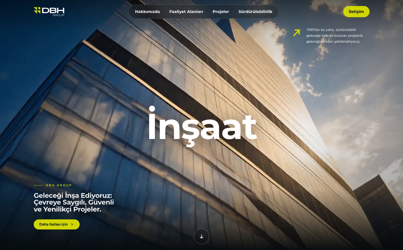
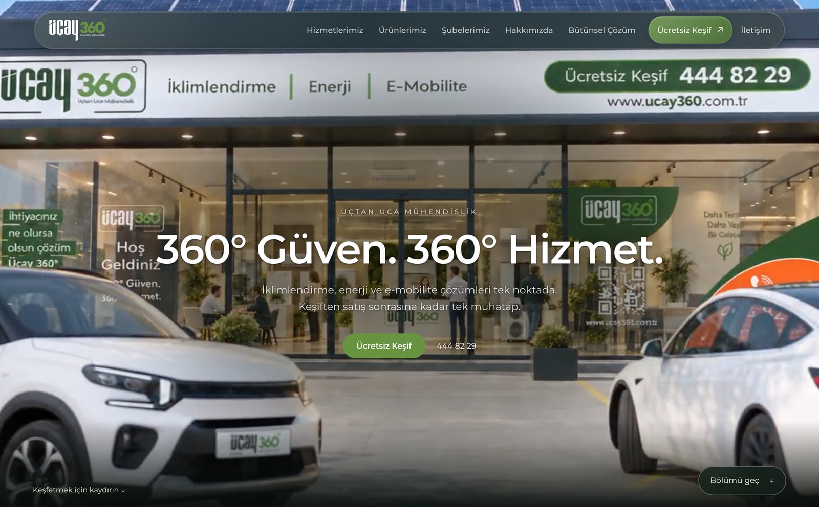
On Üçay 360 the opening is a film played by scrolling: from the store to the home, from heat pump to battery, from EV charging to solar panels, every service of the brand in one scene. On DBH Group the group's logo assembles from a mosaic and becomes the stage, so in the first second the visitor knows this is a group working across several fields.
Service structure: every field gets its place
For companies working in several fields, the key decision is how services are grouped. Visitors should find their need in two clicks; the menu should mirror what clients look for, not the company's org chart.
DBH Group's homepage runs the group's six fields (construction, real estate, mining, technology, energy and tourism) as full-screen sections as you scroll. Each field is its own stop with its own image and short text, all under one group identity.
For search engines a page per main service matters too: someone searching for “heat pump”, “solar panels” or “EV charging station” should land on the page about that service, not on a page that names every service in one paragraph.
Sections that build trust
On a corporate site trust comes from proof, not claims:
- Real projects and references: with images and short outcomes where possible.
- Real photography: the company's own work, places and people instead of stock images.
- Open contact: address, phone, email and a form reachable from every page.
- Legal pages: privacy notice and cookie information.
- Brochures: a downloadable catalogue or a brand film, if there is one, linked from the site.
The design language should carry the company's character
Colour, type and motion speak about a company before any sentence does. A restrained architectural brand and a young tech brand should not share one language.
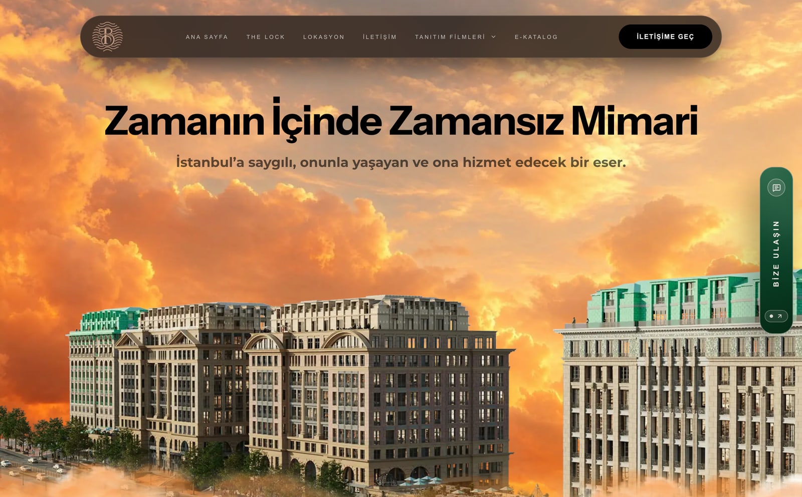
On The Lock Adres Barbarossa the project's architecture of stone, light and water sets the site's tone: an opening at sunset, restrained typography and a calm flow carrying the project, the location, the films and the e-catalogue. The calm of the site is part of the project's idea, “timeless architecture within time”.
Phones and speed
Most visitors to corporate sites arrive on a phone; a design that looks great on desktop but opens slowly on a phone loses the first impression.
Videos and large images carry a site's character, but prepared badly they weigh the page down. Images should be served at the size of the screen, video compressed separately for phones, motion built so it does not strain the device, and everything tried on real phones.
Ready for search engines and AI search
A site is not found just because it is live. A site built right from the ground up is the base for every later SEO effort:
- Each page with its own title and description, the title carrying the phrase the page is searched for.
- Text on the page itself, not inside an image or an animation.
- Structured data (schema) describing the company, its services and contact details to search engines.
- A sitemap and a Google Search Console property.
- With several languages, an address per language and the links between them (hreflang).
- A robots.txt open to AI search engines such as ChatGPT and Perplexity, so they can read the site.
After launch
A corporate site is not a brochure made once and left. As new projects, news and references are added the site stays current, and search engines notice.
Before launch, settle who updates which content, whose inbox the form messages land in and how visits are measured. If a client's message lands in a box nobody checks, all the work on the site is wasted.
Pre-launch checklist
Before your corporate site goes live, check:
- Does the first screen say what the company does in one sentence?
- Does every main service have its own page?
- Are real projects and images used?
- Is the contact form reachable from every page, and do messages reach the right person?
- Does the site open fast on a phone, on mobile data?
- Does every page have its own title and description?
- Are the privacy and cookie notices in place?
- Has the sitemap been submitted to Search Console?
Short answers
Which pages should a corporate website have?
For most companies: home, services (one page per main service), projects or references, about and contact. A blog or guides section is added when the site should bring in clients from search.
Can a corporate site be a single page?
For one product or one project, yes. When a company offers several services, a page per service works better for visitors and for search engines.
Is a ready-made template enough?
It works when the site has to go live fast. When a company needs to stand apart from its competitors, custom design makes the difference; the website cost guide covers the trade-off.
Topics
- corporate website
- what a corporate website needs
- corporate website design
- company website design
- business website checklist
- corporate web design Istanbul